Map Design
Introduction
Here at the Metro Route Atlas, one of our primary goals is to be able to create system maps for rapid transit networks across the globe in an internally consistent fashion. This requires incorporating existing standards and terminologies and attempting to marry them all together in a way that can be done easily and consistently.
On this page we will describe our design philosophy as well as the standards put in place here on this website.
Our Maps
Our system maps focus on rapid transit, with different modes being represented with thinner or thicker lines, among other changes. We aim for our map to be useful to those living in or traveling to a city, so although we have a focus on geography, our maps tend to simplify geography unless it affects wayfinding. As we aim to have a robust standard that can be utilized across cities around the globe, some local characteristics unfortunately are lost - for example, unusual or less common service patterns may not be depicted (e.g. DC rush hour Yellow line service; rush hour and weekend/late night service patterns in New York City) and paid transfers are shown the same way as other transfers (e.g. out-of-system transfers). Some unique service patterns may be shown but others will be left out.
It may be worth noting that due to our focus on urban rail, intercity and long distance rail is explicitly not shown on our maps, and transfer points with these systems are not noted. Commuter Rail will typically be cut off at the end of an urban area in system maps. Long distance rail lines that have infrequent commuter service may be subject to arbitrary cutoffs in strip maps based on frequency of service timetabling/electrification status at the time their entries were created on the website.
What aspects of geography get distorted and which services are shown in what way are dependent on the city. For example, in a city with only a few lines, we may choose to show BRT-Lite/arterial bus rapid transit/rapid bus lines that do not meet the qualifications for BRT (such as Salt Lake City) while comparable service in a city with many lines (e.g. Select Bus Service in New York City) would not be shown. It is for these same reasons that the Washington DC and Atlanta Streetcars are largely inconsequential on the city maps, as they are a comparatively irrelevant mode of transportation in their respective cities with respect to the metro systems. With specific regard to BRT, which corridors are treated as such on this website depends on the ITDP score rating as well as relevance to the city. As such, some corridors that do not qualify as BRT may be shown, while others that do qualify as BRT may not be. Relevance to public transportation in the overall city is key.
Map Guide
Here we will showcase a brief sample of map components, covering station types, modes, and other nuances.
Topics: Lines and Modes Stations Mode Switch Line Merging
Lines and Modes
Our maps follow a 'width = importance (speed, frequency, and capacity)' hierarchy, with Metro/Rapid Transit being the mode with the widest lines. Beyond this, S-Trains, Light Rail and Modern Trams, and True BRT have a moderately wide line. These medium to high modes either lack in frequency or capacity compared to Metro systems, though they come close in terms of speed and general importance to a city. Finally, Streetcars/Trams, BRT-Lite, Arterial Bus Rapid Transit, Rapid Bus, Commuter Rail, Funiculars, and CPT have thin lines. These are either infrequent (require a timetable), slow, or have lower capacity in general when compared to other modes.
As of September 2021 (Santiago de Chile), we also use thinner lines for BRT w/ a dedicated ROW for on-street open busways without dedicated stations (e.g. Santiago, where the busways do not have stations but instead have platforms scattered wherever they fit) and secondary BRT lines where the difference in quality between the primary network and the secondary lines is immense (e.g. Recife, where Via Livre has massive stations and Av. Sul's stops are barely more than a nameless shelter).
Note that S-Trains operating as Rapid Transit will have their line width increased to that of Metro/Rapid Transit. In addition, prior to January 2020 there was a Monorail line designation with a single strip down the middle. This has been deprecated so that the single strip format can be reused for lines that use two colors in their branding. Monorail, Suspended Railway, and Maglev lines are therefore grouped under Metro/Rapid Transit, Secondary Metro/Rapid Transit, and People Movers as far as lines on maps are concerned, depending on usage. The Seattle Monorail is grandfathered in as it is the only example that used the old format without using the new criteria (the Las Vegas Monorail fulfills both criteria).
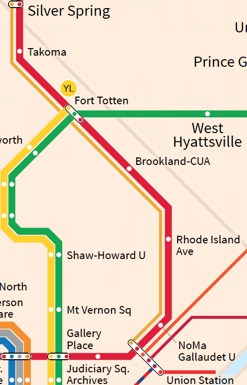
For an example of our width criteria, see the above image, which is from Washington DC. The Metro Lines are thick and clear, while the commuter rail lines and Streetcar are thin. Had the MARC Brunswick Line been the same thickness as the Red Line, it would have seemed like a reliable express service to Silver Spring when in reality, it is a weekday peak only service that as of July 2019's timetable fields its last train of the day from Silver Spring to Union Station at 9:01 AM with no further eastbound service until the next day.
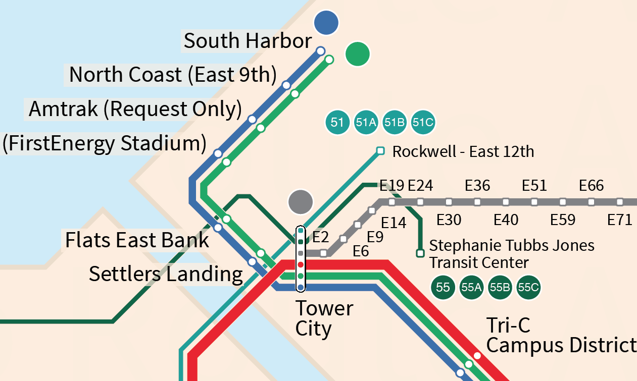
Note: Due to more stringent minimum standards for definitions, the MetroHealth Line and Cleveland State Line are no longer featured on the Cleveland map. However, the reasoning behind this example still holds. Here is another example depicting Downtown Cleveland. The MetroHealth Rapid Bus Line is directly contrasted with the Red Line Subway here. The MetroHealth line makes frequent stops, lacks BRT features, and is of far lower speed and reliability than the Red Line. In contrast, the light rail and HealthLine BRT are much thicker, showcasing their speed and reliability when compared to the regular bus lines. Due to the percentage of line width, they also seem much thicker than the rapid bus lines when compared against the metro, highlighting that they are a comparable mode of transport to the latter.
Please note that our mode designations do not directly translate to map designations. For example, regional rail trunk lines share the same line style as S-Trains even if the regional rail network barely functions as a network. For the two pairs of Primary-Secondary line widths, these will be used as appropriate - for example, the DLR (Light Metro) is secondary compared to the London Underground (Rapid Transit), and the Volgograd Tram (Tram) is secondary compared to the Volgograd Fast Tram (Light Rail). This will be done on a case by case basis.
Stations
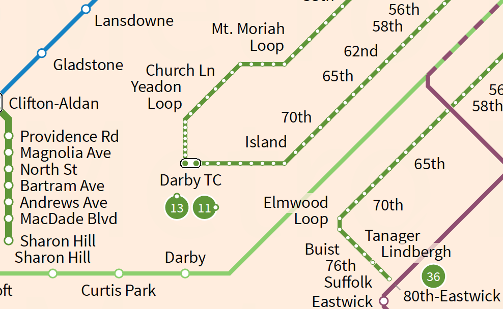
Stations can be a finicky thing in the world of public transportation, with 'station' and 'stop' blurring for Streetcar/Tram and Bus services. In general, we use circles for rail and rounded squares for bus/funicular/CPT lines, and use smaller icons for when buses and streetcars/trams run on the street, making local stops. Note that if a line switches between having proper stops and not having proper stops, we may choose to keep using a standard symbol for consistency when viewing the map. For example, Providence Rd and Magnolia Ave on the Sharon Hill line in Philadelphia don't have platforms but all other stations on the Sharon Hill line do and therefore use the 'station' icons, while the southern portion of the Route 36 Trolley from Buist to Eastwick are in a separate right of way with actual platforms but use stop icons. Even in the Philadelphia map there are exceptions, as the streetcar portion of the Media line is shown with stop icons to highlight the incredibly closely spaced platform-less stops in downtown Media.
Depending on the city, the smaller icons may be used sparingly (accompanied by a 'Not all Stops shown') disclaimer. Major transfer points will always utilize the Transfer icons as shown above - note that in older maps we did not distinguish between street stops and stations in our transfer icon. There is NO distinction on our maps between paid transfers and in-system transfers. The actual fare structure a city uses can vary wildly even in the same metropolitan area, so we have chosen to sacrifice the ability to distinguish paid and free transfers for a cleaner map. Note that if two services serve the exact same stations or stops, only transfers with other lines and points of divergence will be shown as transfer stations despite the fact that any of the stations on the route could be used as a transfer point. For a city like Miami, for example, where the Orange Line is really just a branch of the existing line, showing every station as a transfer point would be overkill, confusing, and unnecessary.
In new maps and updates to existing maps (Feb 2021 and onwards), there are additional icons. We provide a Walking Connection icon where there is an unprotected external transfer with a walking distance that is 'significant' (depends on the city). We also have additional symbols for one-directional service. In old maps, we had a triangle embedded in the lines, which was easily confused with a station icon. Later on we used arrows outside of the line, but this does not work in cities such as Chicago, and so in the future one of the two one direction only symbols will be used depending on the city. In addition to this, there are symbols for stations and transfers served in a single direction only - primarily to avoid having to specify 'e/b only' and similar things on maps and secondarily to support European tram networks where junctions have a single platform before/after on each branch and where transfers can be messy to show. These station symbols do not distinguish between stations and stops and will only be used on lines where there is two directional services but services only stop in a single direction.
In addition to the other symbols, we have a Part Time Service symbol as well. This icon is used to show that a station is only served part-time, but given how ambiguous 'part-time' can be, especially with Commuter Rail systems, we have chosen to heavily limit the occasions where this symbol is used. In general, rush/peak hour only service, special events service only, etc. use this. Rush/peak-hour only service line styles are also provided, but usage is city-dependent. As of January 2022, all services that only run during AM or PM rush hours on weekdays use this line style instead of only rush hour extensions of services, and a uniform line width is used instead of a smaller one. Finally, we have a modified terminus icon used for short-turn services, but this is only used in cities where multiple distinct services use the same line and short-turn at the same time. See Line Merging later on for an explanation on why this is uncommon in our maps.
As of September 2021, old maps undergoing adjustments and new maps use a new transfer icon system. While harder to identify at a glance, it allows for a single standard icon to be used at all stops, simplifying certain aspects of map design for us.
Mode Switch
One of the existential questions in the development of this site is the classification of a transit line. When is a Tram considered Light Rail? How much of a bus route must be BRT-standard to qualify it as a BRT route? And what do you do when some lines are branded in a way that makes this entire process aggravating?
The only cases where we will show mode switches are for: 1) regional rail trunk lines where infrequent commuter services bunch together to form a several station long metro-frequency corridor but where the component services run as commuter rail services (e.g. Philadelphia), 2) S-Train lines through-running into Metro corridors, 3) Subway-Surface networks where low frequency streetcar grade lines merge into a high frequency rapid transit corridor (e.g. Philadelphia), and 4) Bus Rapid Transit Corridors where there is a clear drop in infrastructure quality at a certain location.
For BRT, we prefer to show entire routes or cut off at the end of BRT corridors (e.g. Pittsburgh). This depends on the type of network and how we are depicting it though - if we are depicting BRT corridors on the map and not services, then only corridors will be shown (the services branching off will not be shown at all). However, if we are depicting services, the preference is to show the entire route at the BRT thickness, especially if the route oscillates between differing grades of ROW quality. As of September 2020, we have made the decision to show a mode switch for sub-BRT standard corridors only in the case where they make up a significant portion of the route or provide a clear point where infrastructure quality drops off for a significant part of the route (e.g. Pittsburgh P3, Boston SL3 between Silver Line Way and Chelsea, Las Vegas SDX on the Strip).
The general rule here is that if a proper bus rapid transit service loses a dedicated ROW but otherwise maintains BRT quality (branded stations, off-board fare payment, etc), we do not shrink the line. However, if quality degrades to that of a standard limited stop bus, we will shrink the line. On the other side, if an arterial BRT service has a short portion of dedicated busway or other bus infrastructure, we will show that dedicated infrastructure with a thicker line. BRT-Lite services only receive this treatment if they are classified as BRT-Lite due to insufficient length and not due to other deficiencies.
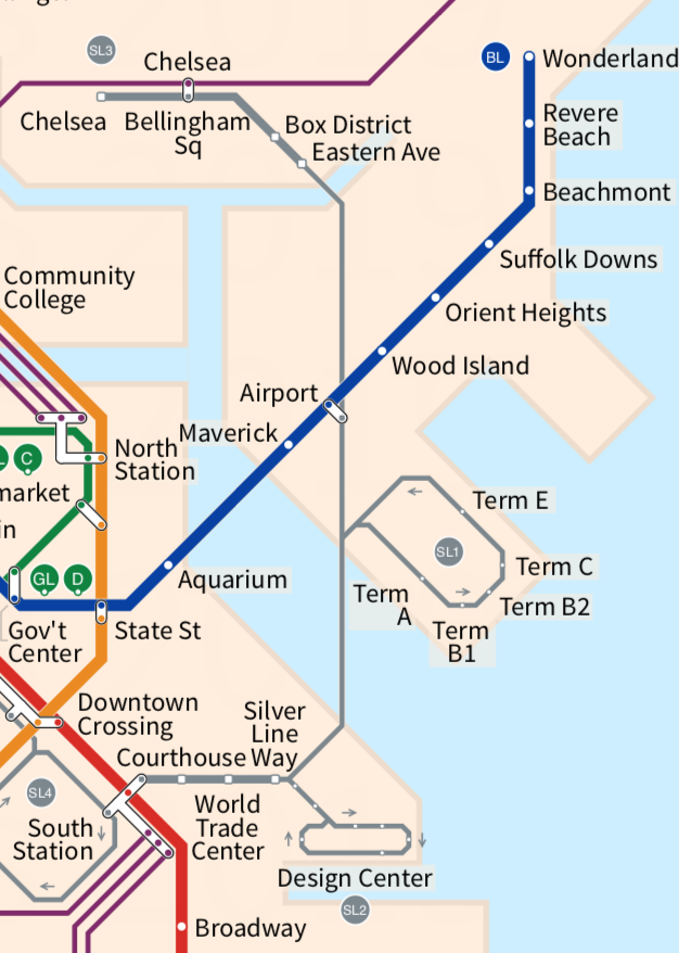
For an example of our BRT guideline, see above. In between the Chelsea Busway and the Silver Line Busway is a section where buses run in mixed traffic on a highway. What isn't immediately clear from this map is that there are other obstacles - the bridge after Eastern Ave gives priority to river traffic over buses, resulting in long delays. In addition, east of Silver Line way, buses make a five (or 15, depending on traffic) minute detour in order to enter the highway. Both of the busways on the outer ends are proper BRT but the section in between is not.
Line Merging
When should services be combined into a single line and when should they be rendered separately? This is a significant issue of concern on networks prioritizing one-seat rides over transfers and systems with significant interlining of services. After all, there's only so much space on the map, and multiple infrequent services should not appear to be more important than a high frequency service.
Urbanrail.net chooses to predominantly merge down to a single line containing all services. We perform this on a case-by-case basis wherever there is simply not enough space on the map to justify showing multiple infrequent services running on the same line. For the most part, Metro, Light Metro, Modern Tramways, and Light Rail will always have their services separate. Trunk lines will be utilized whenever possible. In general, the highest 'importance' mode will have all services shown while less 'important' modes will be shown as a merged service if needed.